
01 / BRANDING & PACKAGING
MUGSHOT
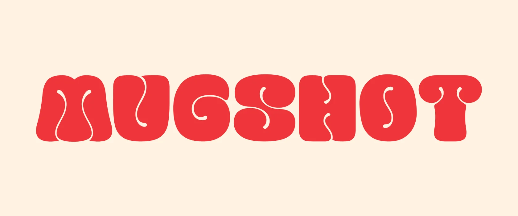
MUGSHOT is a self-initiated coffee brand. I started with an everyday cup and used its shape to build an identity recognizable on a paper cup, a fence banner or an Instagram post.
Explore the project ↓
THE STARTING POINT
How much of a brand can you build from a cup?
I wanted to see how far I could take an everyday shape. The cup had to work as a standalone mark and carry a design across an entire surface.
I developed the wordmark, cup illustration, palette and pattern. The mockups show how I combined them for different formats.
01 / LOGO DEVELOPMENT
From a rounded sketch to a bold wordmark.
I tried the playful, rounded lettering in red and white. The final wordmark uses bold geometric capitals and can stand alone. The red cup signals coffee and works on small surfaces by itself.


02 / DESIGN SYSTEM
Wordmark, cup and pattern.
The wordmark is the primary logo. The secondary version combines the name and cup. Small surfaces can use the illustrated cup or its simplified silhouette. Repeating the cup at an angle creates the pattern. Bright red adds accents, warm beige and off-white give the pattern room, and charcoal provides contrast. The brand board shows Lemon Milk Bold and Mont Heavy.
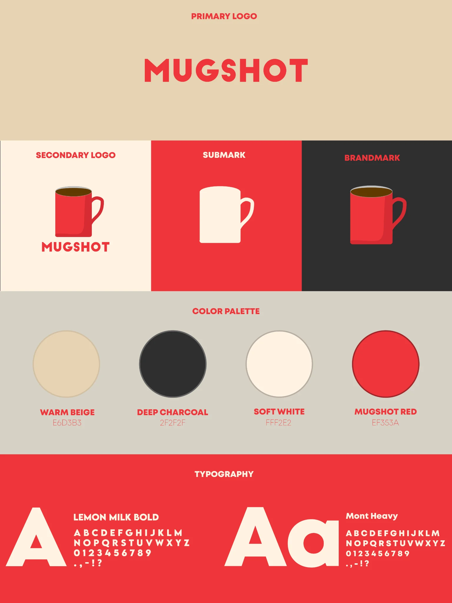
COLOR PALETTE
Four colors for MUGSHOT.
- Warm Beige#E6D3B3
- Deep Charcoal#2F2F2F
- Soft White#FFF2E2
- MUGSHOT Red#EF353A
TYPOGRAPHY
Bold capitals.
Lemon Milk Bold and Mont Heavy round out the system. The geometric lettering contrasts with the softer shape of the cup.
03 / PRINT & PACKAGING
One motif across two small surfaces.
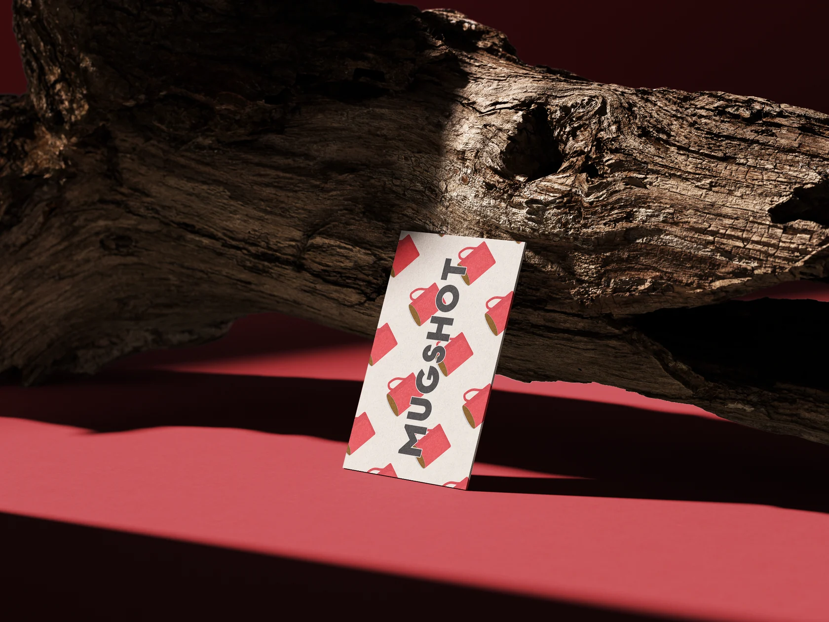
The red cup carries the paper cup design. On the business card, repeated cups form a background for the dark wordmark. The shared shape connects the two applications.
04 / SIGNAGE
How the brand reads at a distance.
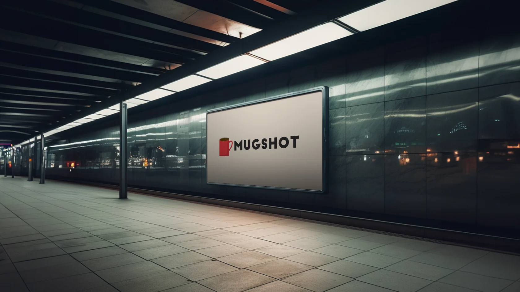
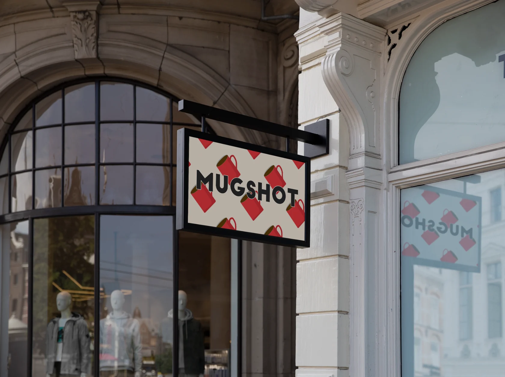
The station display places the cup beside the dark wordmark on a plain background. On the hanging sign, the wordmark sits over the colored pattern. The mockups show how the mark, name and pattern take up different amounts of space in each setting.
05 / DIGITAL & OUTDOOR ADVERTISING
A pattern for small and large formats.
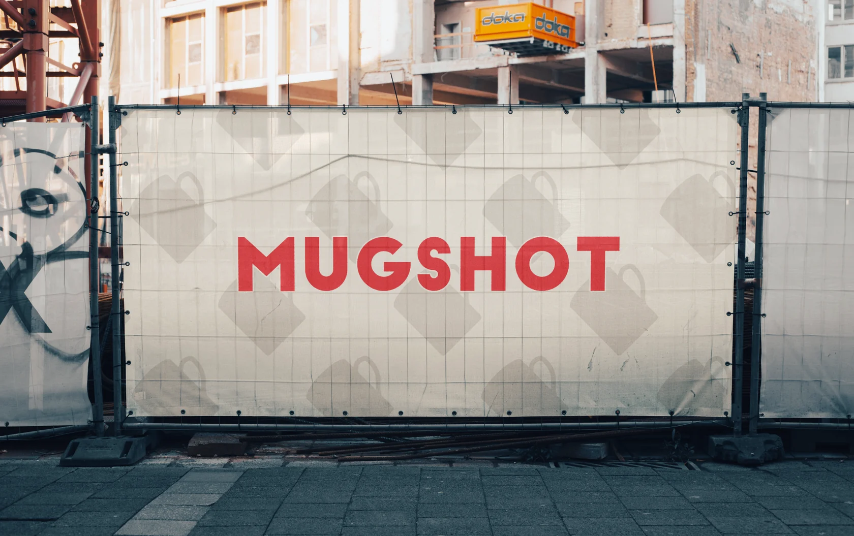
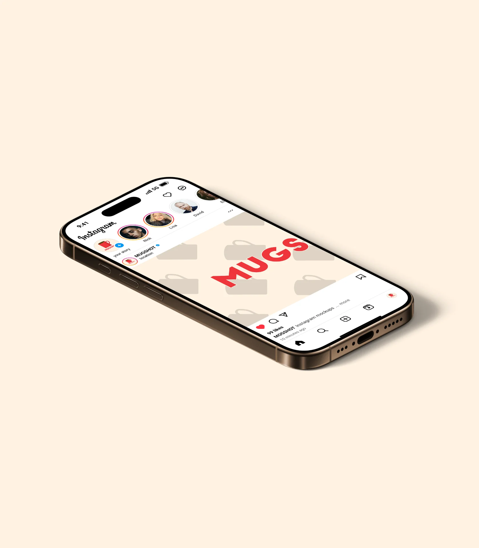
On Instagram and on the fence banner, the red wordmark sits on a pale pattern of cup silhouettes. The pattern stays quiet so the lettering reads first in both formats.
THE OUTCOME
A flexible identity.
The format determines which elements I use: the wordmark, the red cup and the pattern. The cup can carry a small surface on its own, while the pattern can fill a large layout. Both stay recognizable as MUGSHOT.
YOUR PROJECT
Have something in mind?
Tell me what you're working on. Together we'll find a visual direction that fits.
Start a project ↗