
02 / POSTER SERIES
Frisch serviert / Vol. 1
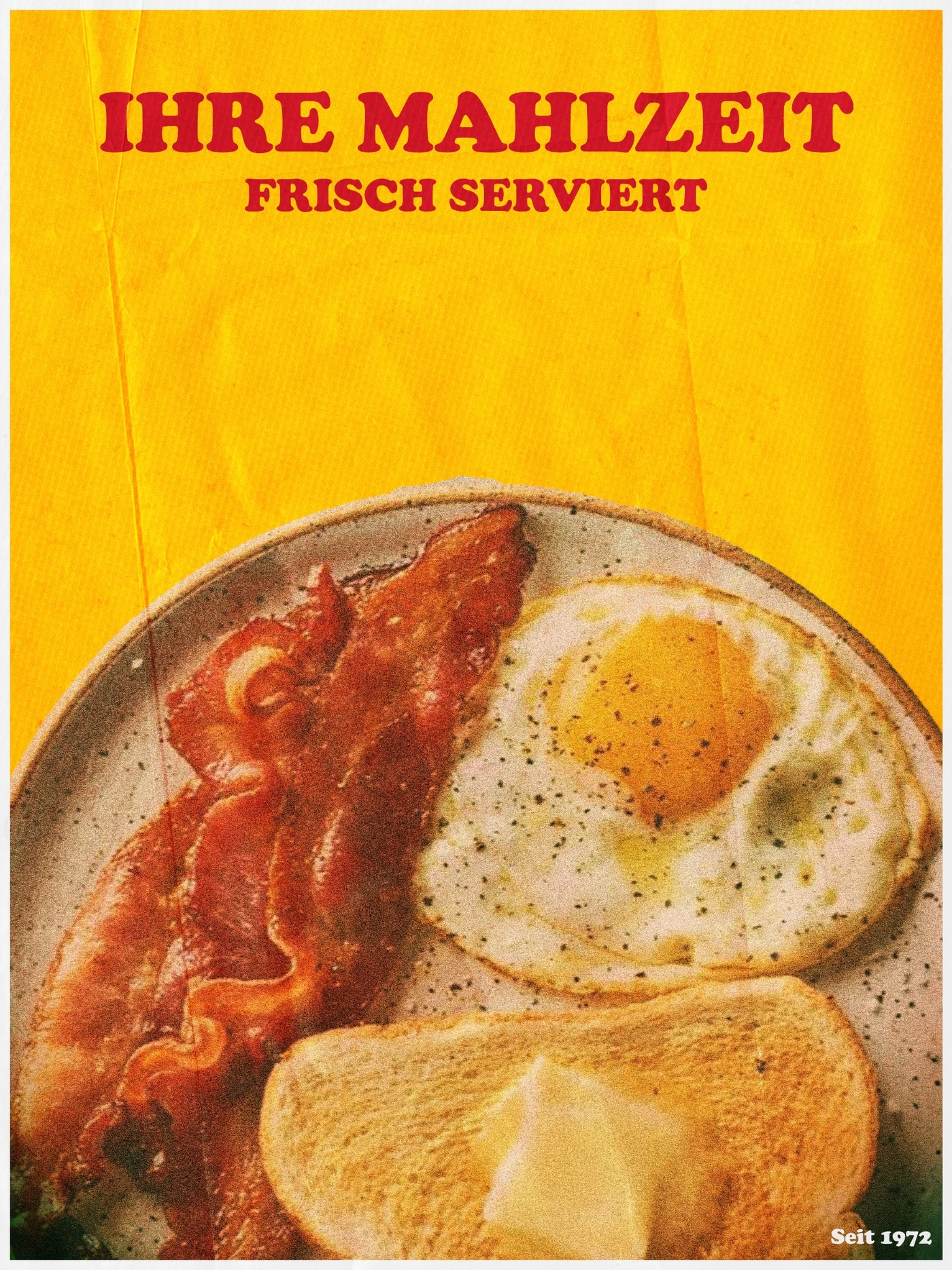
Five everyday meals in a shared visual style. Frisch serviert / Vol. 1 draws on old menus and cafeteria graphics, with bold typography and deliberately imperfect print textures.
Explore the project ↓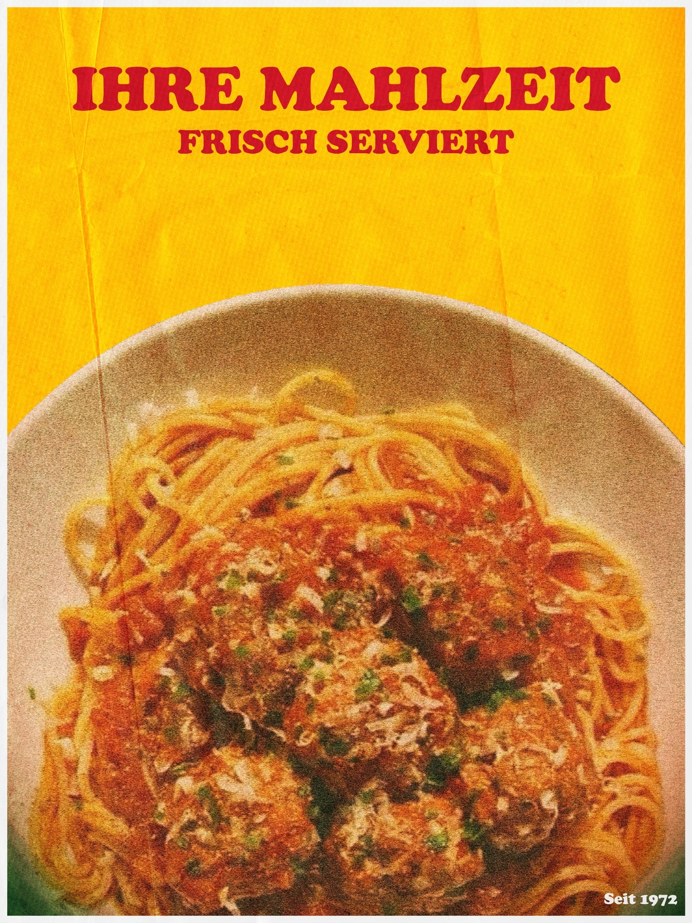
THE DESIGN IDEA
Everyday meals with a printed feel.
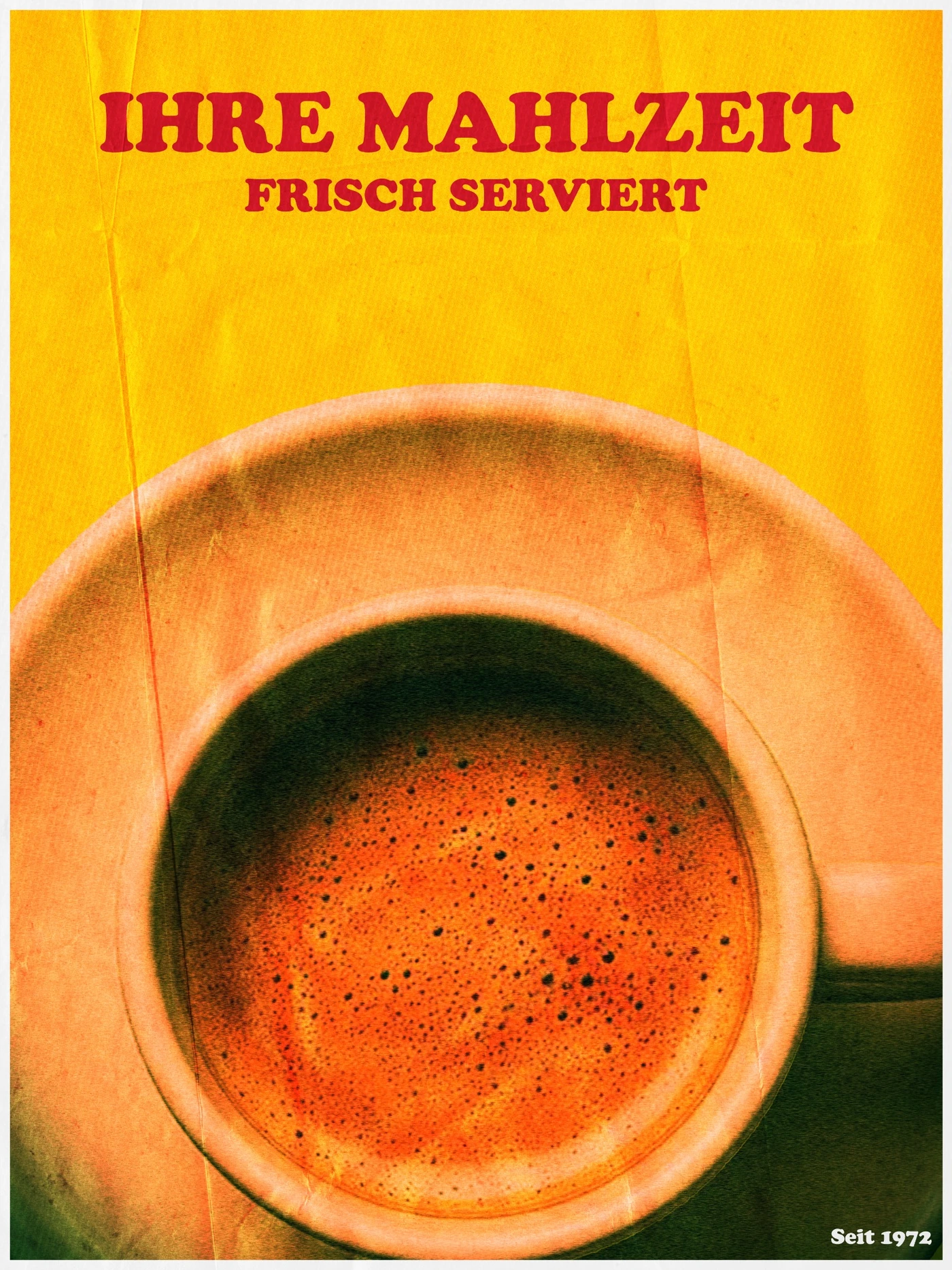
Coffee, pasta and plated meals are familiar moments from everyday life. The retro styling evokes nostalgia across eras. All five posters share a layout and stand on their own.
My role covered concept, image composition, typography and texture. Created in Photoshop.
01 / IDEA & GOAL
Turning meals into a series.
Old menus, cafeteria graphics and everyday printed materials were the starting point. A recurring layout ties the collection together, and the different dishes give each poster its own character.
02 / DESIGN APPROACH
One layout. Five subjects.
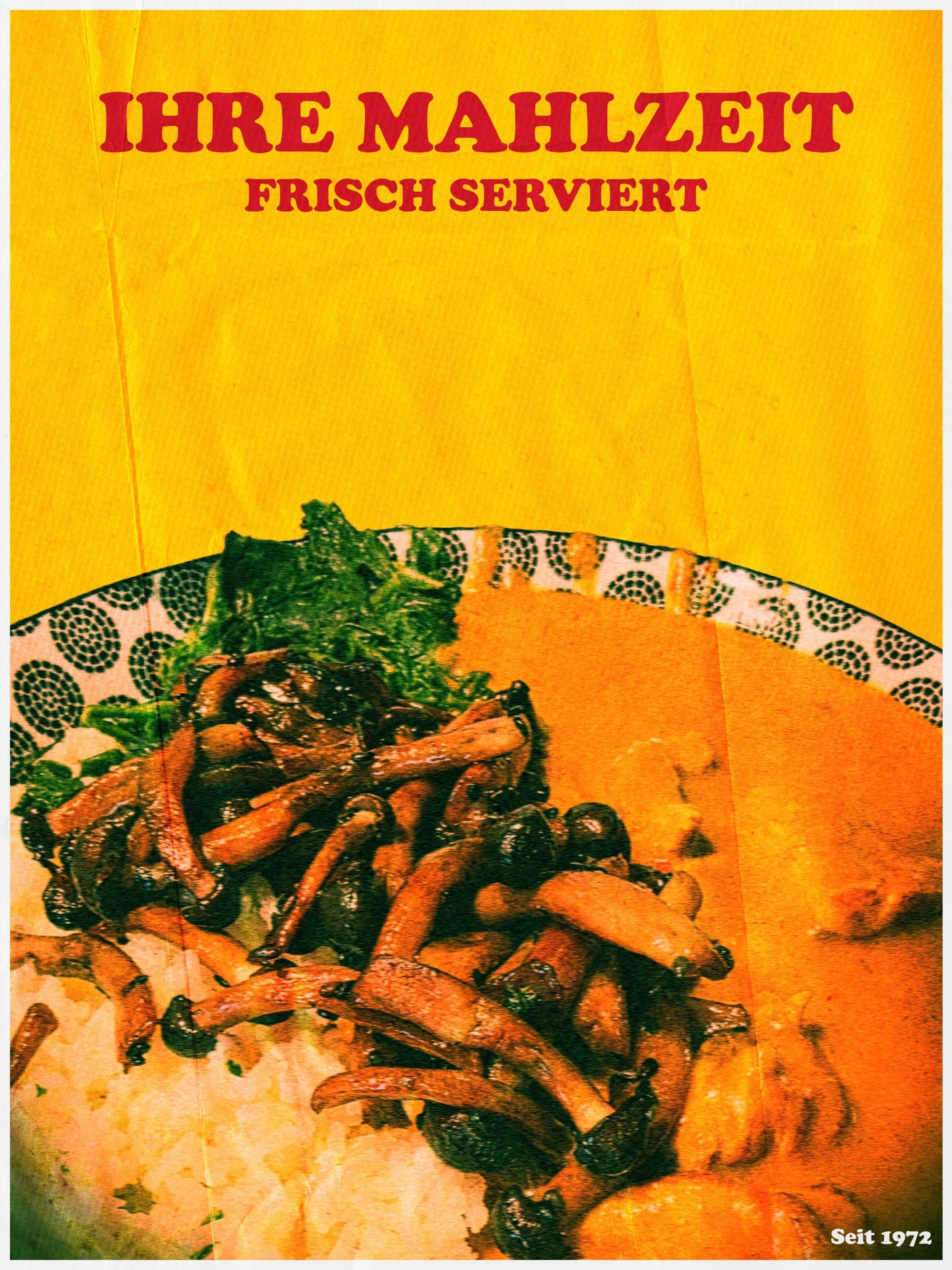
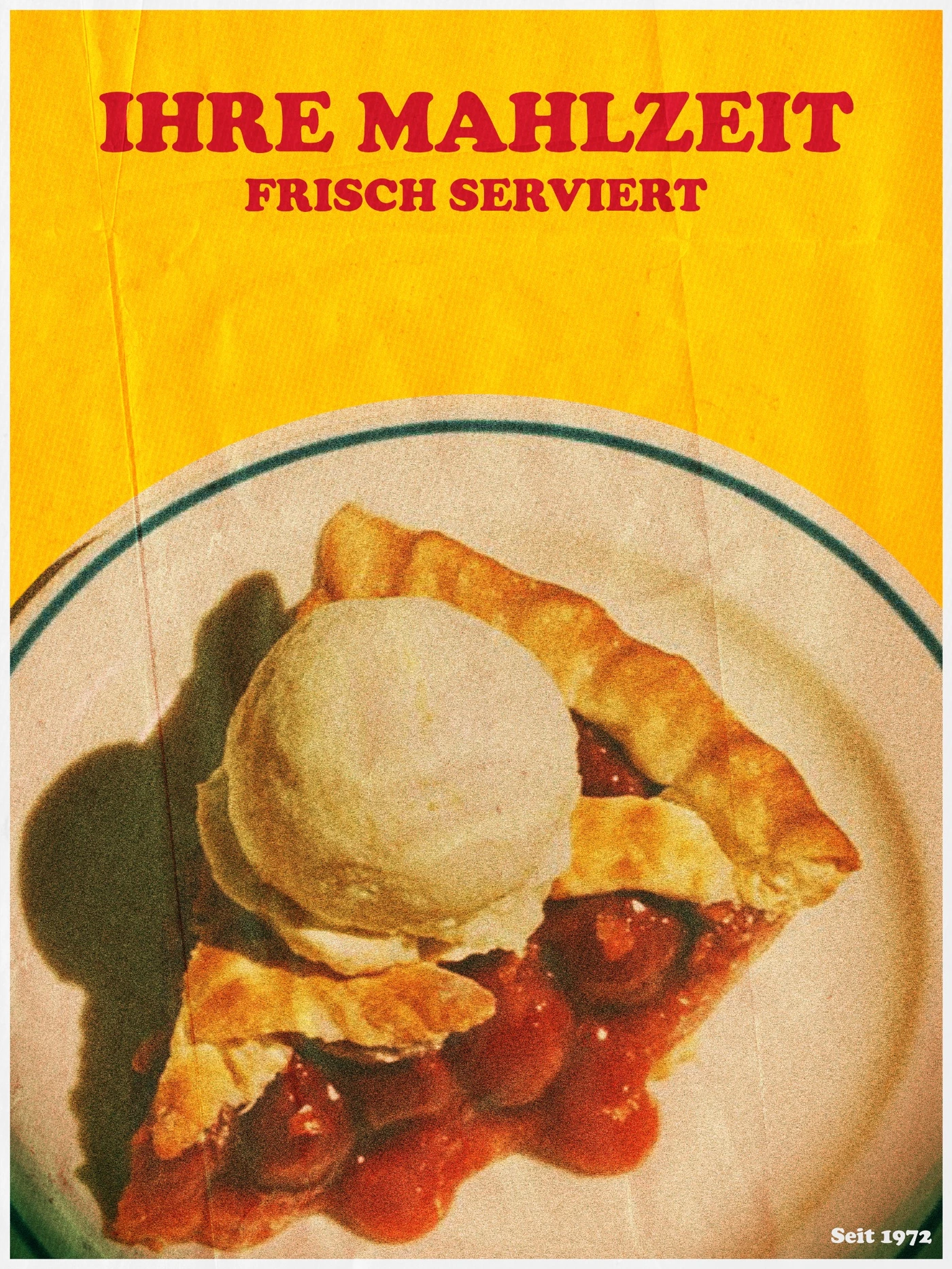
A shared headline, limited palette and similar crops tie the posters together. The quiet coffee image sits alongside busier plates, giving the series rhythm.
03 / EXECUTION
Texture is part of the idea.
Grain, color shifts and paper textures evoke aged prints. Soft edges and visible irregularities give the images a tactile quality.
04 / OUTCOME
Strong on their own. Recognizable together.
The five posters show how a repeatable design system can bring different images together. The approach also works for poster campaigns and recurring communications.
YOUR PROJECT
Have something in mind?
Tell me what you're working on. Together we'll find a visual direction that fits.
Start a project ↗